In 1995, Jakob Nielsen, a renowned usability expert, published a paper titled "10 Usability Heuristics for User Interface Design." The paper outlines ten guidelines that designers can use to evaluate the usability of user interfaces. These heuristics are still relevant today and are widely used by designers around the world.
But let's be honest, reading a research paper can be boring. So, let's take a more fun approach to learning about these heuristics by applying them to Mario. In this blog post, we will take a journey through the Mushroom Kingdom and explore how the principles of UI/UX design can be observed in Mario's world.
So, grab your controller and let's jump into the world of Mario to learn how applying heuristics can improve UI/UX design. 🎮 🍄
01 Visibility and Feedback
We have already discussed this heuristic in the introduction, but to summarize, it emphasizes the importance of providing users with clear and visible feedback. In Mario, visibility and feedback are critical to the game's success, as the player needs to understand the game's status to make progress
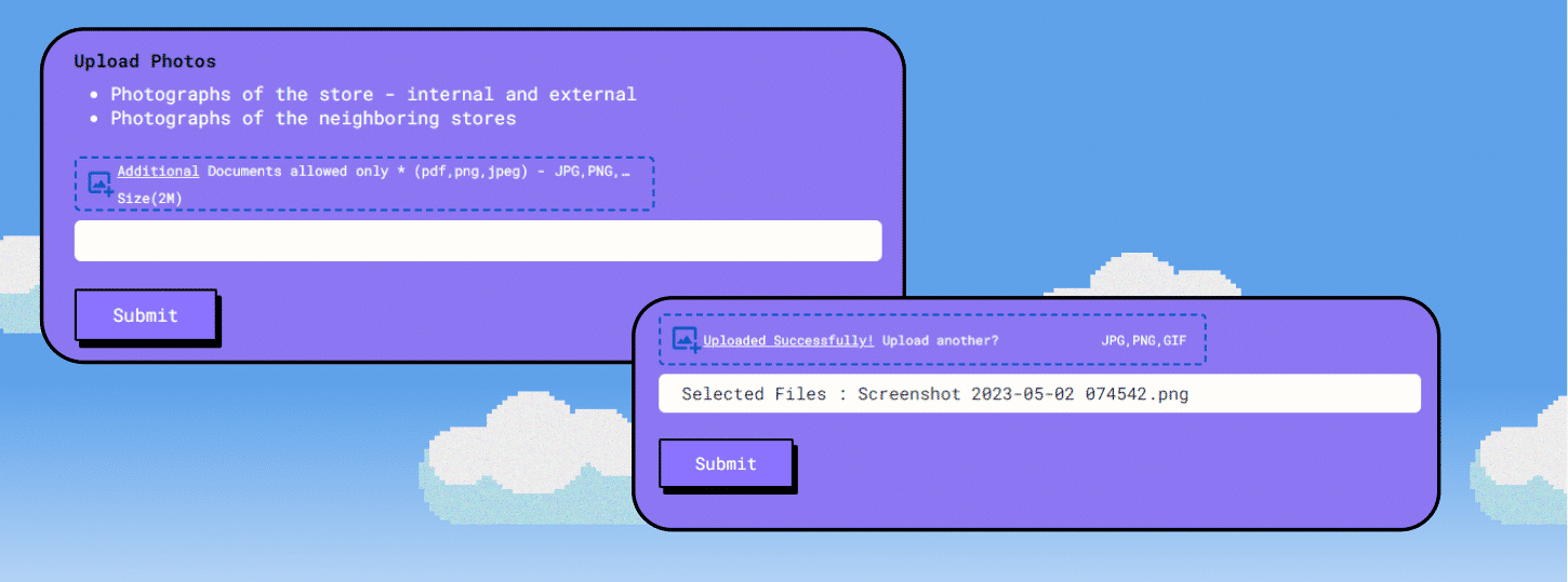
The principle requires clear system status indication and feedback for users. The message
confirms successful image upload, increasing system visibility. It assures users their action was
successful, leading to a positive experience.
02 Match between system and the real world
This heuristic emphasizes the importance of using language, concepts, and actions familiar to users. In Mario, this heuristic is applied in various ways. For example, the game's controls are easy to understand and use, with actions such as "jump" and "run" being intuitive to the player. Similarly, the game uses objects and concepts from the real world, such as coins, to make it easier for players to understand.

It's important to consider that adding products to a shopping cart is a familiar process for most users.
Therefore, using clear language for this action can help streamline the user experience.
03 User control and freedom
This heuristic emphasizes the importance of giving users control over the system and the ability to undo actions. In Mario, the player has full control over Mario's movements, and they can undo actions by rewinding time using the game's power-ups. This gives players the freedom to experiment and try different approaches to overcome obstacles.

By providing users with the ability to move one step back on every screen, they can easily correct mistakes or
explore different options without having to start their search over again. This enhances the user's sense of
control and freedom while using our app, resulting in a more positive and satisfying experience.
4: Consistency and standards
This heuristic emphasizes the importance of using consistent and standard design elements across the system. In Mario, consistency can be observed in the game's level design, where obstacles and enemies are introduced gradually, allowing players to understand the game's mechanics and adjust accordingly.

Implementing clear and concise labels for input fields. For instance, using labels such as 'From' and
'To' will make it easy for users to understand the required information they need to provide.
5: Error prevention
This heuristic emphasizes the importance of using consistent and standard design elements across the system. In Mario, consistency can be observed in the game's level design, where obstacles and enemies are introduced gradually, allowing players to understand the game's mechanics and adjust accordingly.
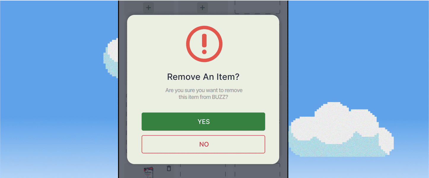
When deleting an item a confirmation pop-up will appear to prompt the user to confirm the action. This is
important for any destructive or significant actions, such as deletion, and ensures users are always asked
to confirm before proceeding.
6: Recognition rather than recall
This heuristic emphasizes the importance of designing systems that do not rely on users' memory to complete tasks. In Mario, this is achieved through the game's level design, where obstacles and enemies are visible to the player, allowing them to react quickly and avoid them.
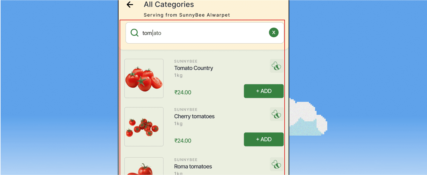
Providing real-time suggestions that appear instantly, enabling the user to quickly recognize and
select their desired search query, resulting in a faster and more efficient search experience.
7: Flexibility and efficiency of use
This heuristic emphasizes the importance of designing systems that cater to both novice and expert users. In Mario, this is achieved through the game's power-ups, which allow novice players to progress through the game, while expert players can use them to complete levels quickly and efficiently.
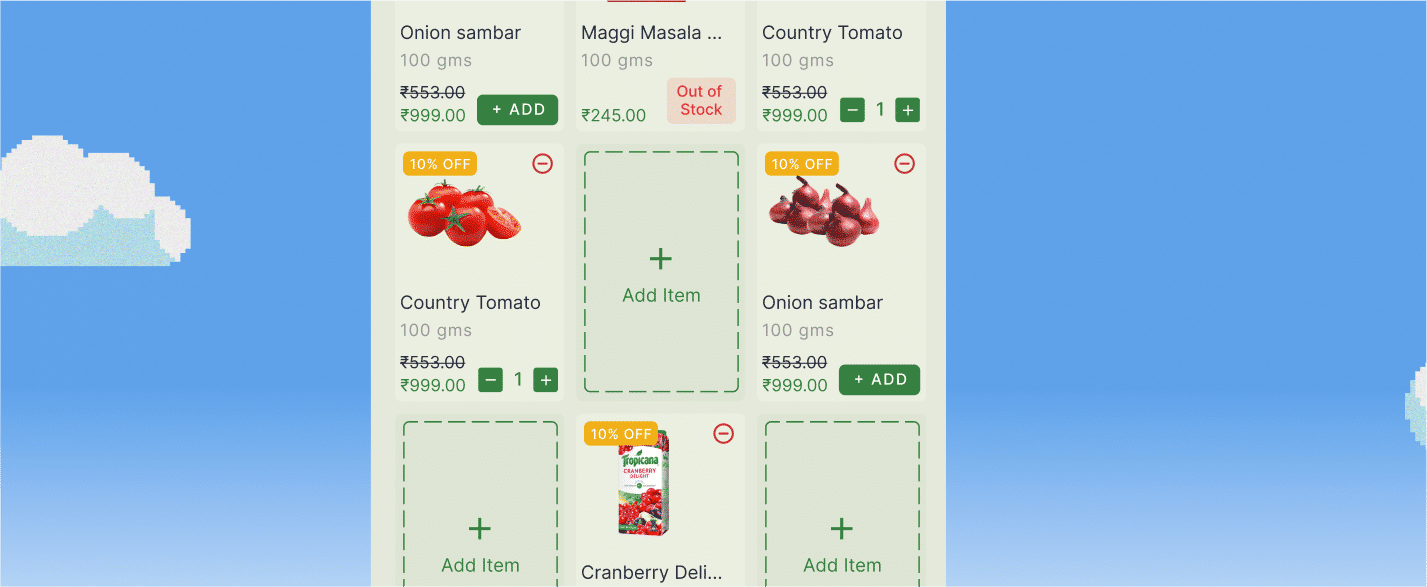
The screenshot exemplifies the flexibility and efficiency of the app, particularly for power users. It
showcases how users can customize their products and add them to their Buzz Lists, which can then
be ordered with a single click, streamlining the ordering process.
8: Aesthetic and minimalist design
This heuristic emphasizes the importance of designing systems that are visually appealing and free of clutter. In Mario, the game's graphics are simple and minimalist, allowing players to focus on the gameplay and providing a seamless user experience

The screenshot above shows a hero section that is designed with minimalistic and clutter-free elements,
featuring only two clear call-to-action buttons. This strategic design enables users to focus solely on the
section we intend them to see and perform an action, resulting in a streamlined user experience.
9: Help users recognize, diagnose, and recover from errors
This heuristic emphasizes the importance of designing systems that help users understand and recover from errors. In Mario, this is achieved through the game's power-ups, which allow players to rewind time and retry levels, helping them learn from their mistakes.
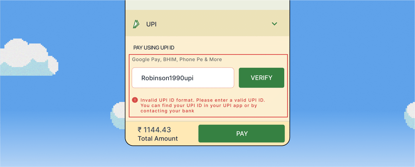
The error message should explain what went wrong, suggest the correct format, and provide a way to correct
the error and resubmit the form. This will help users recognize the error, diagnose the problem, and recover
from it by providing the correct information.
10: Help and documentation
This heuristic emphasizes the importance of providing users with help and documentation when needed. In Mario, this is achieved through the game's tutorials and manual, which provide players with information on the game's mechanics and controls.

The app's highlighters serve as useful guides for users, aiding in their navigation and understanding of
how to use the application effectively. This feature not only helps users to learn the application quickly
but also makes the navigation process much smoother.
From Gaming to Mobile: How Mario's Heuristics Can Be
Applied to Mobile UI/UX Design

01
Design for One-Handed Use
In Mario, the game is designed to be played with both hands, with the left hand controlling Mario's movement and the right hand controlling his actions. Similarly, in mobile UI/UX design, it is important to design interfaces that can be easily used with one hand. Designers can achieve this by placing important controls and buttons within easy reach of the user's thumb.
02
Prioritize Important Information
In Mario, important information such as the player's score, lives remaining, and time remaining to complete the level are displayed prominently on the screen. Similarly, in mobile UI/UX design, designers should prioritize important information and ensure that it is easily accessible to the user. This can be achieved by using large, bold fonts, and contrasting colors to draw the user's attention.
03
Use Simple Navigation
In Mario, the game is designed with simple navigation, with Mario moving from left to right, jumping over obstacles and enemies. Similarly, in mobile UI/UX design, designers should use simple navigation that is easy to understand and use. This can be achieved by using clear and concise navigation labels, minimizing the number of clicks required to navigate the interface, and using a consistent navigation structure across the application.
04
Use Gestures
In Mario, players use gestures to control Mario's movement and actions, such as swiping left or right to move or tapping to jump. Similarly, in mobile UI/UX design, designers should use gestures to enhance the user experience. This can be achieved by using gestures such as swiping, pinching, and tapping to navigate the interface or perform actions.
05
Use Visual Hierarchy
In Mario, visual hierarchy is used to draw the player's attention to important elements, such as power-ups or enemies. Similarly, in mobile UI/UX design, designers should use visual hierarchy to help users navigate the interface and understand the importance of different elements. This can be achieved by using contrasting colors, larger fonts, and bold text to highlight important information.
06
Optimize for Speed
In Mario, the game is designed to be fast-paced, with players having to react quickly to avoid obstacles and enemies. Similarly, in mobile UI/UX design, designers should optimize the interface for speed and ensure that it is fast and responsive. This can be achieved by minimizing the number of images and videos used in the interface, optimizing code and reducing load times.